Wednesday, May 27, 2015

DATABASES - QUERY DATA

DATABASES - QUERY DATA

In today's lesson, we started looking up data by using Query Design. Query Data is useful because it sorts information, looks for patterns and lets you find information you are looking for. Attached below are images of what I did and how I did them.

In the first screenshot, I went on query design and put in <2000 (less than 2000) in the engine capacity field.


I then pressed run and all the data with <2000 engine capacity cars showed up like this:


In the third screenshot, again I went on query design and put in <=2000 (less than or equal to 2000) in the engine capacity field.


I then pressed run and all the data with <=2000 engine capacity cars showed up like this:


In query design I put in >2000 (greater than 2000) in the engine capacity field.


I ran the data and all the cars with >2000 engine capacity cars showed up like this:


In query design I put in >=2000 (greater than or equal to 2000) in the engine capacity field.


I ran the data and all the cars with engine capacity >=2000 showed up like this:


In query design I put in 'BETWEEN 1000 AND 3000' in the engine capacity field.


I ran the data and all the cars with engine capacity between 1000 and 3000 showed up like this:


In query design I put in 'audi OR BMW' in the manufacturer field.


I ran the data and all the audi or BMW cars showed up like this:


In query design I put in 'audi' in the manufacturer field and >3000 (greater than 3000) in the engine capacity field..


I ran the data and all the audi cars that have engine capacity greater than 3000 showed up like this:


In query design I put in 'not audi' in the manufacturer field.


I ran the data and all the cars except audi showed up like this:


In query design I put in this sign '*' in the manufacturer field as this searches all the cars in the database.


I ran the data and all the cars in the database showed up like this:


In query design I put in 'Is Null' in the manufacturer field as this searches for blank fields in the database.


I ran the data and all the blank fields in the database showed up like this:


'Is Null' is would be used and is useful because if the user has forgotten to fill in some records and they want to fill them in, they can use Is Null to get the blank record and continue to fill in the record.

The difference between Or and And is that Or is if you want to search any one of your chosen record/ data (at least one condition that you entered would show up). And is when you want to search for 2 conditions not only one of them (eg. Audi and <3000 would search all Audi cars that have an engine capacity less than 3000). You have to know the correct time to use OR and AND because they are very different and mean totally different things so you have to be careful and watch out otherwise your data won't come up as you wanted.

When you want to sort the fields, you write in your data and click on sort, use the drop down list and choose ascending or descending and that is how you sort the fields. This is useful because it lets you sort your fields and choose whether you want your data to loom up ascending or descending.

This was an interesting part to the lesson as we learned how to use databases and search for data that we specifically need.

Wednesday, May 6, 2015

DATABASES

DATABASES

In today's lesson, we started a new topic - Databases. We started using the Microsoft Access software. First, we started of by making a form. We then added the information in the correct data areas and then made it look nice by changing the background colours, the font and adding a picture. This is how my form looked:


The second part of the lesson was setting up the information type in design view. 
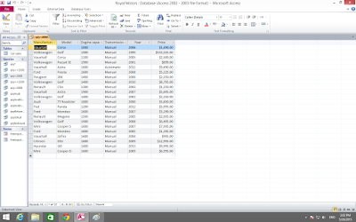
First we added information about cars and the picture below is the type of information we added. 


Then, we went to design view and added some information and set some things so the user can only put a certain amount of information at a time.
This is how the design view looks.


We  then set up the information. First we changed the field size of the model to 20 like this:


Now the user will not be able to type in more than 20 letters as I previously changed the field size to 20.


Then we changed the engine capacity information in the input mask section to only let someone to add 4 digits of information and no more. We called it CC.


Now the user will not be able to put in more than 4 numbers in the engine capacity section. This is how the engine capacity information looked in the actual view.


We then changed the transmission field to only let the user to select automatic or manual. To do this, we used Lookup Wizard. The picture below shows how we used Lookup Wizard.


Now the user will only be able to choose from automatic or manual.


The last step was changing the price currency to pounds by going on the format option at the bottom and changing the currency to whatever you want like shown in the image below:


Now when the user enters in a price, it will automatically change into dollars.


This was our task to do for 2-3 lessons. It was challenging and took a while to get the hang of it but I soon got used to it. 


Wednesday, April 15, 2015

MY FINAL WEBSITE!

MY FINAL WEBSITE!

In today's lesson, I finally completed my website and it was a success! :) I added information, pictures, rollover buttons and made my website creative! It turned out really nice! When I opened it on Google Chrome, everything was working properly as I had planned it to be. Here are the 4 pages of my website:

Page 1: Home - Just basics about football.

Page 2: EPL Teams - All the teams of the Premier league with their logos.


Page 3: Info - About the objective of the game football and what the players like the Goalie, Defender, Midfielder and Striker have to do during the game and their positions.


Page 4: Gallery - A few pictures of players when they play football etc. 


I really enjoyed this topic because my website was a total success and it was a lot of fun playing around and finding out different information. There is only one thing that I could have improved and that is if I would have made my footer the same colour as my banner o maybe a different shade of blue. The reason why I kept it as green was to show that it was the field of a football pitch. Overall, it was an awesome project and I hope I make more websites in the future! :)

Tuesday, March 24, 2015

WEBSITE OBSERVATIONS!

WEBSITE OBSERVATIONS!

In today's lesson, we observed different websites over the internet and looked for the good things/ factors included on each website. We had to look at how the information is presented, the button style and more factors a good website needs. We also had to look at the bad things about the website or what they could have done to improve the website. 

Website 1 - Sky Sports 

http://www.skysports.com/


This is the sky sports main page. It is very well presented and it has buttons and different links. It can take you to the home page, sports, videos etc and they all work perfectly. There are main updates like what has happened frequently on sports and they have included a good range of pictures. The colour scheme is really good and really suits the sports theme well.


This page of the website is where you can watch live sports online and chose what you want to watch. You can even watch the highlights of previous games or any game you like. It runs and opens very smoothly. 


This is near the bottom of the website where you can get more information and updates on what has been going on the past few days or the main events taking place too. It has a good amount of pictures. I think the information is a bit too packed and there is a lot to read. They could have just kept the main parts or the important events on the main page and the others under another link/ page.


Website 2 - Apple Store

http://store.apple.com/ae


This is the apple store main page. It has a good variety of pictures and different updates. The website also works really quickly and is managed well. They don't have much information to tell us more about their products but they have many other pages that give more prices of their products. It is a good website if you just want to browse and get ideas of what to buy (by also looking at the price rates and comparing them to other things).

Wednesday, March 11, 2015

MAKING OUR WEBSITE - ROLLOVER BUTTONS/ IMAGES

MAKING OUR WEBSITE - ROLLOVER BUTTONS/ IMAGES


In today's lesson, we made rollover images so that when ever the mouse goes over any of the buttons, the buttons change to light up or change to a different style. I also saved these as JPEG files. Attached below are my main buttons and also my rollover buttons/ images. 


The top ones of each of the buttons are the main buttons that you will see on the website whilst the bottom ones of each of the buttons are the rollover buttons/ images.


Tuesday, March 3, 2015

MAKING OUR WEBSITE

MAKING OUR WEBSITE

In today's lesson, we started using dream weaver to make our website. We started off with the basics like making the whole layout and adding the banner, footer and all the buttons. This is how it looks.


I used lens flare to add the brightness to some areas of my button and this made my buttons look more effective. I saved my images in two types: JPEG file (saving as a picture) and a PSD file (on photoshop) so I can go back to my work and change it if I ever need to. The software I used to make the buttons was Photoshop and to create my website I used Dream Weaver. To improve my website, I could have made my buttons the same colour as my banner so it looks much better. But I hope the overall website turns out really good and I hope this project will be a success!

Wednesday, February 25, 2015

MAKING BANNERS, FOOTERS AND BUTTONS FOR OUR WEBSITE!

MAKING BANNERS, FOOTERS AND BUTTONS FOR OUR WEBSITE!


In today's lesson, we started making the banner, footer and buttons for our website. To make these buttons, we used Photoshop. My website is about Football! To make our buttons better, we used the lens flare options in the filter section. I haven't completed all my buttons but I hope to complete them by next lesson. Below is how it looks so far.


This is my banner.


This is my footer.


This is my first button, the Home button.


This is my second button, the EPL teams button.


This is my third button, the gallery button where I will add pictures.


This is my fourth button, the info button where I will add rules and more information.

What I can do to improve my buttons is I can keep the background colours the same as the banner on the top so it can look more professional. I have kept the banner a light blue to represent the sky during a football match with a lens flare that represents the sun. I have kept the footer a light green to represent the field during a football match so it can match the whole football themed website!